Good embroidery starts with artwork that has been designed for thread rather than simply reduced from a print or screen design. This guide explains the lettering heights and column widths that normally produce a clean, readable embroidered result.
Lettering height
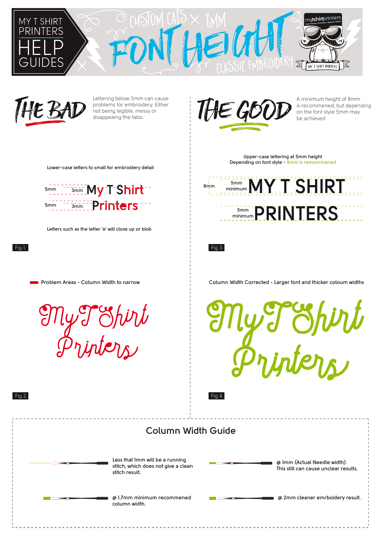
Lettering below 5 mm can become difficult to read, messy or disappear into the fabric. Upper-case lettering at around 5 mm may be possible with some font styles, but 8 mm is recommended wherever the design allows. Lower-case lettering generally needs more height because features such as the letters “e” and “a” can close up or blob when stitched.
Column width
A column narrower than 1 mm will usually need to be sewn as a running stitch, which may not give a clean result. Around 1 mm is the actual needle width and can still produce unclear detail. A minimum column width of approximately 1.7 mm is recommended, while 2 mm normally gives a cleaner embroidered result.
How this affects your design
Simple, bold artwork usually produces the best embroidery. Very fine lines, small text and tightly packed detail may need to be enlarged, thickened or simplified. The practical size also depends on the garment or cap, its seams and the curve of the surface, so we check every design before production.
If you are unsure whether your logo will work, send it to us with the product and quantity you are considering. We will review it and explain any changes that may be needed before you commit to production.